Violations over Time
For this part of data exploratory, we want to use visualization over time to find out some pattern of parking violation frequency in NY in 2021. We want to know how month, weekday and specific time of the day are associated with the parking violation counts.
Monthly Ticket Totals by Borough
knitr::opts_chunk$set(
  fig.width = 6,
  fig.asp = .6,
  out.width = "90%"
)

violation %>%
  mutate(month = month.name[as.numeric(month)]) %>%
  mutate(month = as.factor(month),
         month = fct_relevel(month, "January", "February", "March", "April", "May", "June", "July", "August", "September", "October")) %>%
  relocate(month) %>%
  group_by(borough, month) %>%
  summarize(n_obs = n()) %>%
  ggplot(aes(x = month, y = n_obs, group = 1, color = borough)) +
  geom_point() + geom_line() +
  theme(axis.text.x = element_text(angle = 60, hjust = 1, size = 5) ) +
  labs(
    title = "Total Parking Violations by Month and Borough",
    x = "Month",
    y = "Total Violations"
    ) +
  facet_wrap(~ borough, nrow = 1)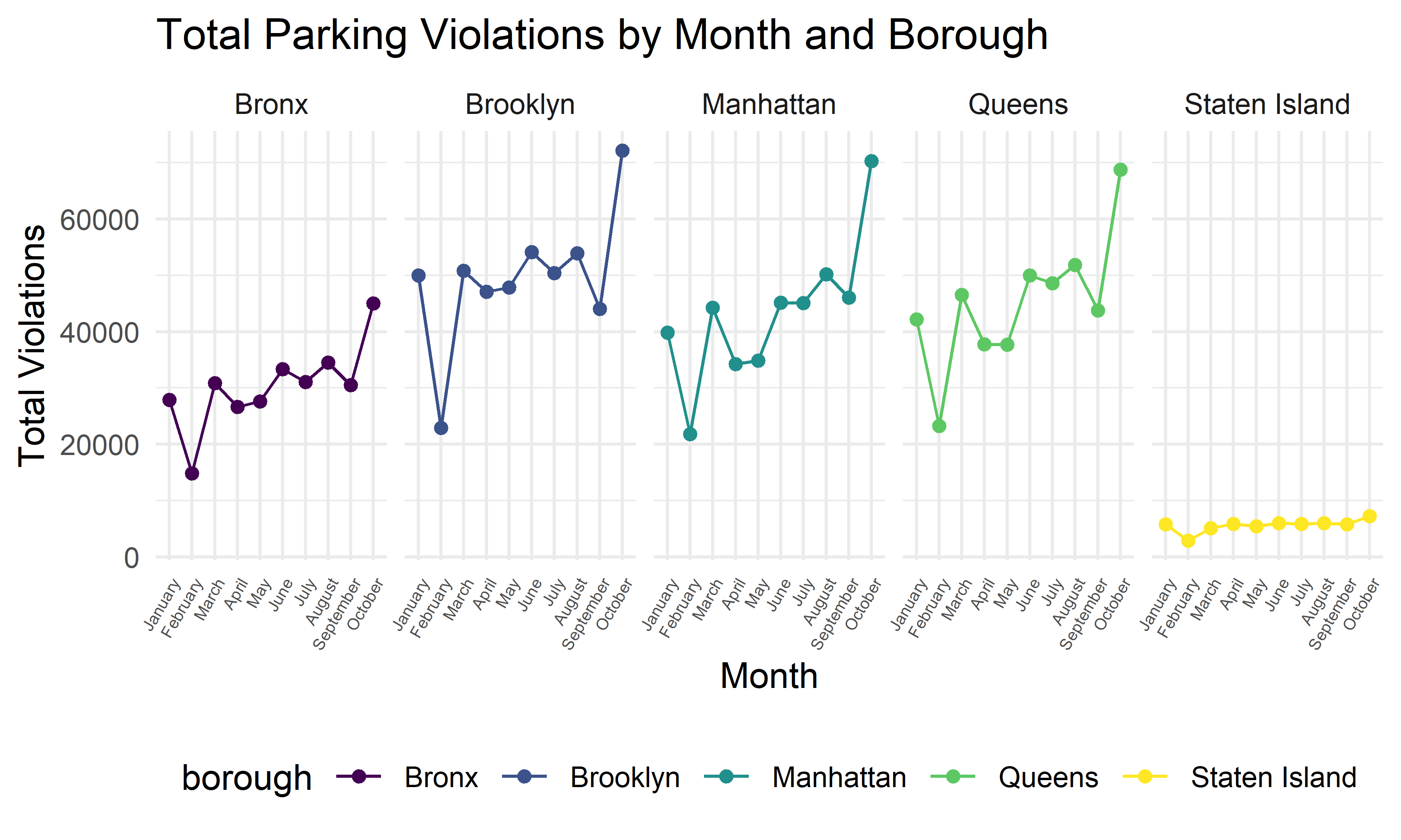
The above plot shows the total number of parking violation within each month for different boroughs. From the plot we can see that all boroughs have a similar pattern, the total violation counts in February is lower, and the total violation counts in October is higher comparing to other months. We can also see that total violation count in Staten Island is much more lower than the other four boroughs.
Ticket Time Series by Borough
violation %>%
  group_by(borough, issue_date) %>%
  summarize(n_obs = n()) %>%
  ggplot(aes(x = issue_date, y = n_obs, color = borough)) +
  geom_line() +
  labs(title = "Total Parking Violations Time Series by Borough",
       x = "Issue Date",
       y = "Total Violations",
       color = "Borough") +
facet_wrap(~ borough, nrow = 5, scales = "free_y") 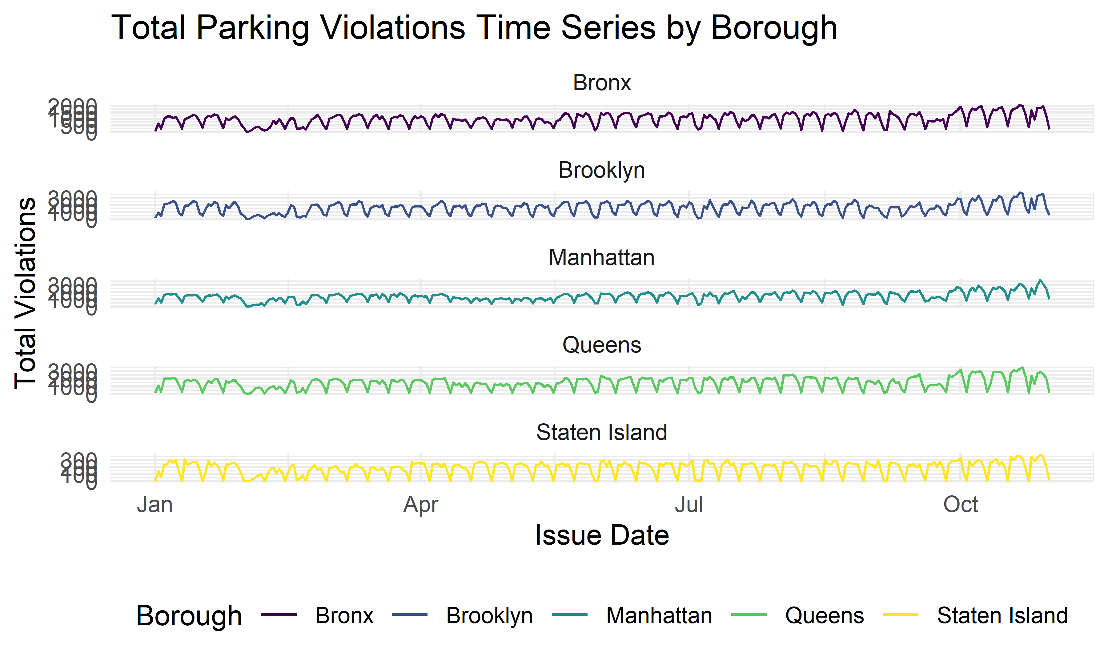
After visualizing the monthly pattern, we also want to know if there is any pattern within each month. The above plot shows the total daily parking violation counts for each month by borough. We see there is a pattern in the fluctuation of total tickets day by day.
Cumulative Weekday Ticket Analysis by Borough
violation %>%
  mutate(weekday = as.factor(weekday)) %>%
  mutate(weekday = fct_relevel(weekday, "Monday", "Tuesday", "Wednesday", "Thursday", "Friday", "Saturday", "Sunday")) %>%
  relocate(weekday) %>%
  group_by(borough, weekday) %>%
  summarize(n_obs = n()) %>%
  ggplot(aes(x = weekday, y = n_obs, group = 1, color = borough)) +
  geom_point() + geom_line() +
  theme(axis.text.x = element_text(angle = 60, hjust = 1) ) +
  facet_wrap(~ borough, nrow = 1) +
  labs(
    title = "Total Parking Violations by Weekday and Borough",
    x = "Weekday",
    y = "Total Violations",
    color = "Borough"
    )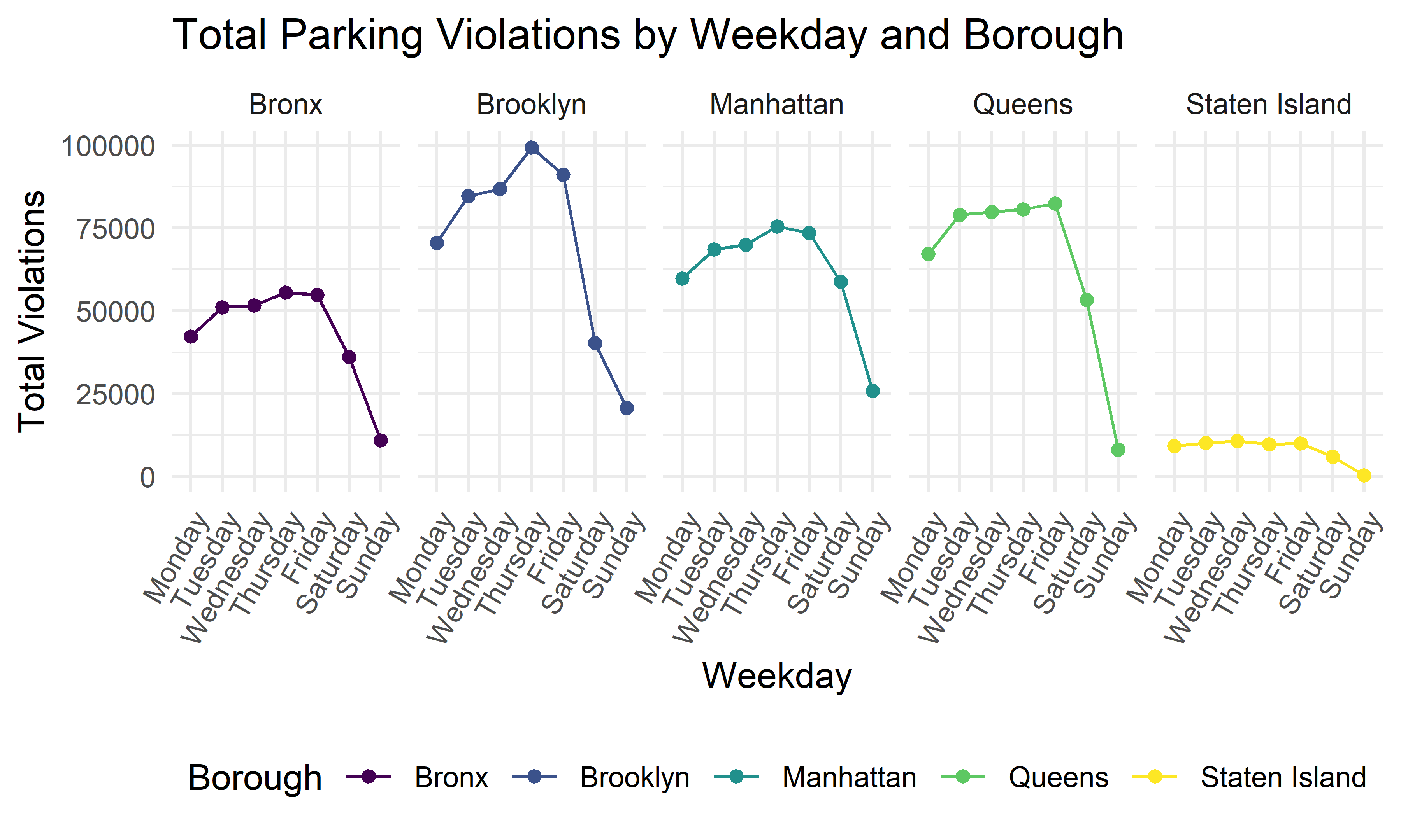
In order to explore more of the weekly parking violation pattern, we plot the violation counts of each weekday for every borough. We can see that all boroughs have a similar pattern, where Saturday has the lowest violation counts and Friday had the second lowest counts comparing to all other weekdays.
Cumulative Hourly Ticket Analysis by Borough
violation %>%
  mutate(hour = as.numeric(hour)) %>%
  group_by(borough, hour) %>%
  summarize(n_obs = n()) %>%
  filter(hour <= 24) %>%
  ggplot(aes(x = hour, y = n_obs, color = borough)) + geom_point() + geom_line() +
  labs(title = "The total number of violations during 24 hours \n of a day in 2021 for each borough") +
facet_wrap(~ borough, nrow = 2) 
Furthermore, we also try to explore the 24-hour violation pattern within a day. From the above plot, all boroughs also show a similar daily pattern. The number of violations tends to increase from 6:00 AM to 8:00 AM, remain high in 8:00 AM to 2:00 PM, decrease from 2:00PM to 7:00 PM, and remain low from 7:00 PM to 5:00 AM.